Above is the final version of the last assignment. I was able to place four of my other classmates into the picture with the time that I had. I learned how to use the puppet warp tool and that was really fun. To the right is proof of my layer masks.
Above is the final assignment for my Computer Graphics class. I had to color a black and white photo and place myself in it. I had to color it in using selection tools and layer blending modes. I could color the image however I wanted. I think that the sky turned out really good. It looks like the sky was originally colored. My biggest challenge was the coloring the trees because it is really hard to make a selection around them. The trees didn't have to be perfect though, so I focused more on the building and placing myself into the photo. I had fun placing myself into the background, and it was easy because I had put myself in pictures before. It was the first time I had taken a picture of myself using a timer on a camera. To the left is a screenshot to show proof of a layer mask when I inserted myself into the picture.
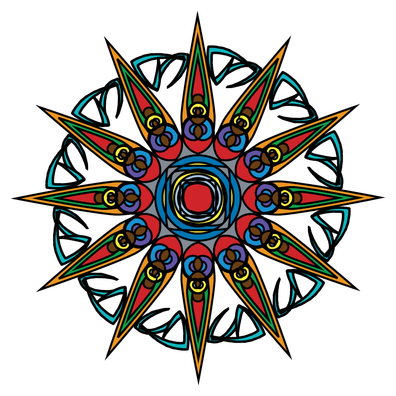
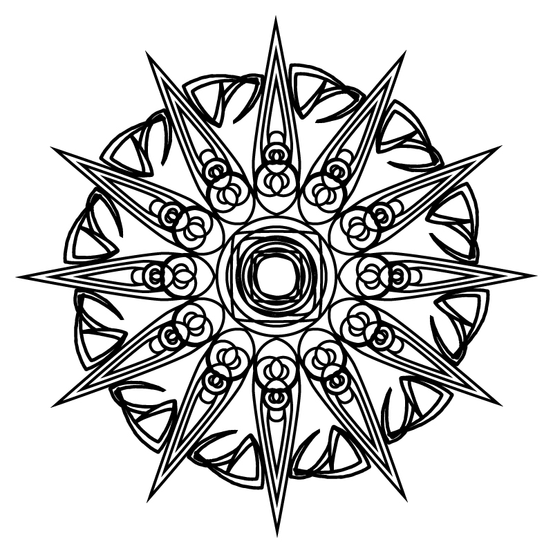
The images above are of the colored and uncolored versions of two designs that my group made during the Art Show. For the Art Show, the class made a coloring book made of abstract line art designs. To make these in a group, everyone made basic elements that would be used to make the final product. We could draw them and scan the elements in or we could create them in Illustrator directly. I mostly used the pen tool and radial balance to make the designs. The most challenging part was to use every group members elements because not all of them always fit.
Above is an abstract line art assignment that I completed. First, I drew the image using a straightedge. Then, I scanned the image into Adobe Illustrator. Then, I converted it into a vector format with live trace. The colors I used are all from the Ice Cream swatch in Illustrator. I had to manually correct all of the imperfections that the live trace left behind. I moved, deleted, and added a lot of anchor points. I find it cool that even though that this would be so much easier to do in Illustrator, all of the imperfections show proof that I drew it originally. I tried to make the colors symmetrical as much as I could. The lines are not perfectly symmetrical so I did what I could with the colors. I think the only real spot where the colors are not symmetrical is in the middle at the top point.
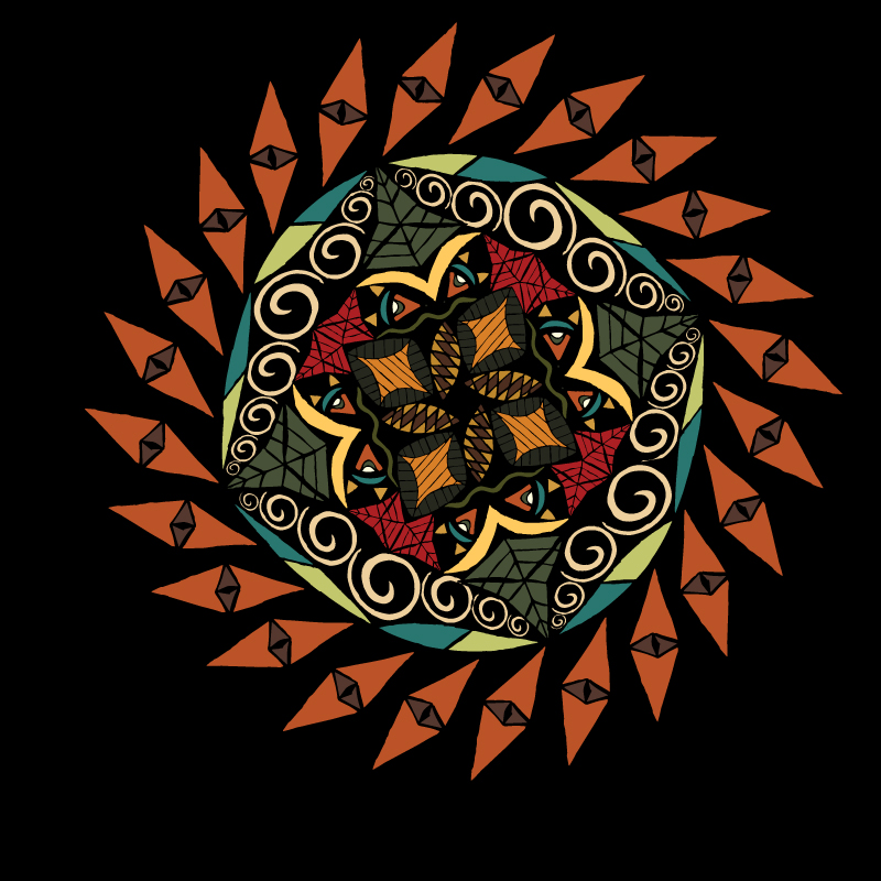
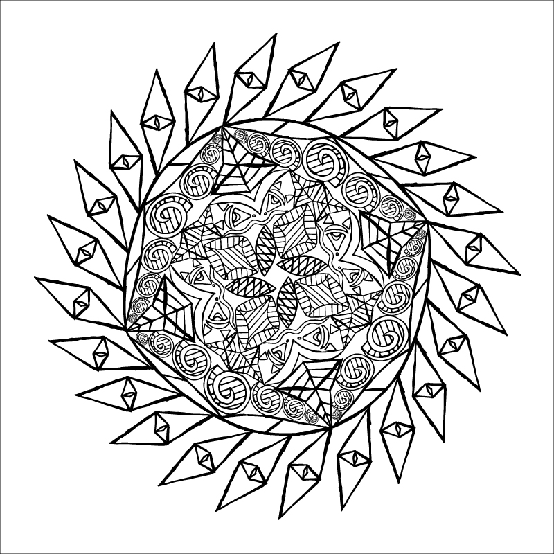
Above is a drawing that another student made at Sac New Tech. Originally the image was created in a line art format. The image was scanned and we were instructed to color it as if it were in a coloring book. First, I live traced it within Adobe Illustrator and adjusted the threshold to close gaps. I then live painted it with 5 colors. I created my own color palette, I didn't follow any color harmony. I like the way it turned out, especially because I colored it in using only Adobe Illustrator.
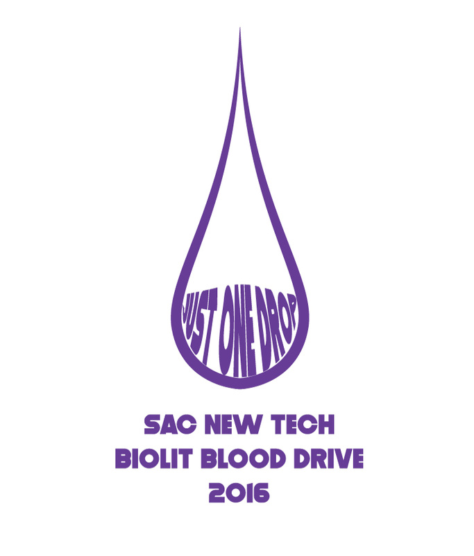
In the above picture, I created a design to go on a T-shirt for the blood drive that my BioLit class is hosting with Bloodsource. Everyone in the class made a design and we all voted for whose will make it on a shirt.To create the blood drop, I fully used the pen tool, so I'm proud of that. I like how the words "Just One Drop" fit inside the blood drop. Because we are making shirts of these designs, we can only use one color for the whole design. I chose purple because it is New Tech's school color.
The above assignment was very fun to work on. It was the first assignment where I worked with green screens in a video. The assignment directly relates to a previous clipping mask project where I put pictures of India inside the word India. I had to explain each image and the explain my final product of all the images. The only problem I had was with moving the green screen video. It wouldn't let me move my person where I wanted it to be. Otherwise, the green screen process was very straightforward. I also added some captions to the pictures because when I was recording, I didn't fully explain why I chose these pictures. Video Link
In the above assignment I was interviewed by a classmate of mine. I edited the video in I movie and added music to the video. Again, iMovie is very easy to use in terms of adding titles and video effects. We had to make questions that were open ended, meaning that it can'tbe answered with yes or no. I had a lot of fun in the recording process. Above is just a slideshow of some of the titles I added in iMovie. The full video can be found here. Video Link
Above are a few screenshots of a slideshow project that I did. In the slideshow project I created a slideshow that showcased things that I liked such as foods, animals, places you want to go, and inspirational people. This was the first project that I worked with iMovie and it was very simple and user friendly. It was easy to add pictures and modify them however I wanted to. Video Link
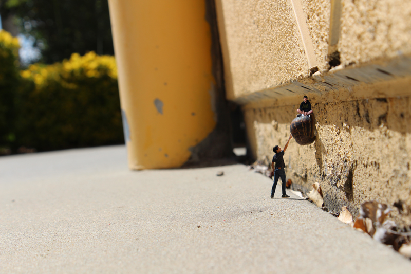
Exaggerated Scale V2: When you're small, the entire world becomes humongous. Michael and I found a snail attached to the wall. It wouldn't budge! Michael tried to sit on it and his weight did nothing. I decided against climbing the snail because I was afraid of drowning in slime. Hopefully we will find a way to enlarge ourselves again.
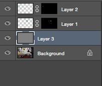
This is the second version of the exaggerated scale assignments. When I was taking pictures I found a snail on a wall near the ground and thought it would make the project a little more interesting. I learned how to make shadows and put them into the picture. You can see the shadow of the snail on the wall as well as the part that I added next to it of Michael on top. I made a shadow of myself too. This was complicated because I needed to make the shadow of my arm go up the wall. I distorted and warped the shadow so it would curve. The only problem is that the warp tool distorts objects mathematically so the shadow of myself curves too smoothly and I think it should be more rigid. Underneath the picture you can see my layers as proof of layer masks.
This is the second version of the exaggerated scale assignments. When I was taking pictures I found a snail on a wall near the ground and thought it would make the project a little more interesting. I learned how to make shadows and put them into the picture. You can see the shadow of the snail on the wall as well as the part that I added next to it of Michael on top. I made a shadow of myself too. This was complicated because I needed to make the shadow of my arm go up the wall. I distorted and warped the shadow so it would curve. The only problem is that the warp tool distorts objects mathematically so the shadow of myself curves too smoothly and I think it should be more rigid. Underneath the picture you can see my layers as proof of layer masks.
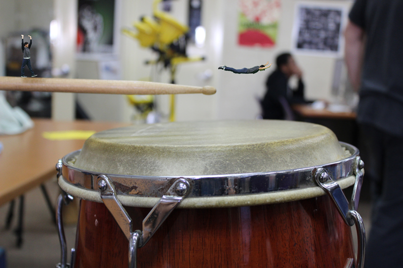
Exaggerated Scale V1: We've been shrunk... Only one of us can be restored to our original size. The competition is as follows. Whoever can make the most noise in one leap from the drumstick. I am in the air trying to bellyflop onto the drum. I know it wont hurt me because of my size. Marquis is going to perform his triple cartwheel into a quintuple tuck with a 720 twist. I think my bellyflop will make more noise though.
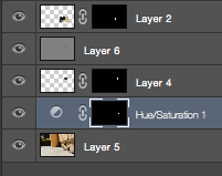
During this project we had to take pictures of ourselves in front of a green screen to be able to cut ourselves out using layer masks. You can see proof of the layer masks in the picture below the project picture. When I edited my photos I noticed that the green screen left a green glow around the photo. It was a very slow process removing the green glow, I had to zoom in and manually erase the green from the outline of the bodies. I also want to point out that I made a shadow underneath Marquis using the dodge and burn tool. I currently don't know how to create shadows without using the dodge and burn tool. This is why I decided against adding a shadow underneath myself. I didn't have to edit the lighting of the three combined images because all of them were shot in the same room.
During this project we had to take pictures of ourselves in front of a green screen to be able to cut ourselves out using layer masks. You can see proof of the layer masks in the picture below the project picture. When I edited my photos I noticed that the green screen left a green glow around the photo. It was a very slow process removing the green glow, I had to zoom in and manually erase the green from the outline of the bodies. I also want to point out that I made a shadow underneath Marquis using the dodge and burn tool. I currently don't know how to create shadows without using the dodge and burn tool. This is why I decided against adding a shadow underneath myself. I didn't have to edit the lighting of the three combined images because all of them were shot in the same room.
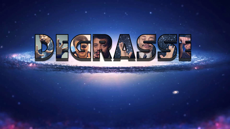
In the assignment above, I trapped pictures of Neil deGrasse Tyson into his name. I modified the bevel and emboss, stroke, inner glow and drop shadow properties of the text. I chose Neil deGrasse Tyson because he is a world renowned astrophysicist and I find that his field of study is particularly interesting. I like how the text looks like it is above the background image. I find the last picture of Neil dropping a microphone very funny.
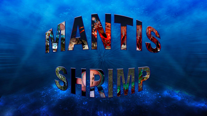
This is a clipping mask project of our choice of animal, insect, or reptile. I chose the mantis shrimp to be my topic. I chose it because I think that the mantis shrimp is a very complex and colorful animal. I love the mantis shrimp because it is the only animal on the earth that can do what it can do. The mantis shrimp's eyes perceive 12 colors while humans can only perceive 3. This means it can see ultra-violet and infra-red light. Within its body it has clubs which the mantis shrimp can swing faster and harder than a .50 caliber bullet. Its shell is extremely hard and dense. They are closely related to lobster, which means that they are impervious to most diseases and they do not die of old age. I used three text effects, bevel and emboss, stroke, and I warped the text. The background is a deep sea wallpaper and I thought that it fit well with the theme of the mantis shrimp.
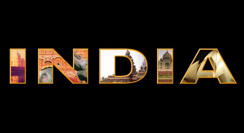
This is a layer and clipping mask assignment that I did in Photoshop. We selected a country outside of the United States and found pictures of the country and encased it in the country name. I chose India because it was the first country that came to mind and I knew I could put elephants in the assignment somewhere. Through this assignment I learned about text effects such as bevel and emboss, stroke size, and expanding and contracting font.
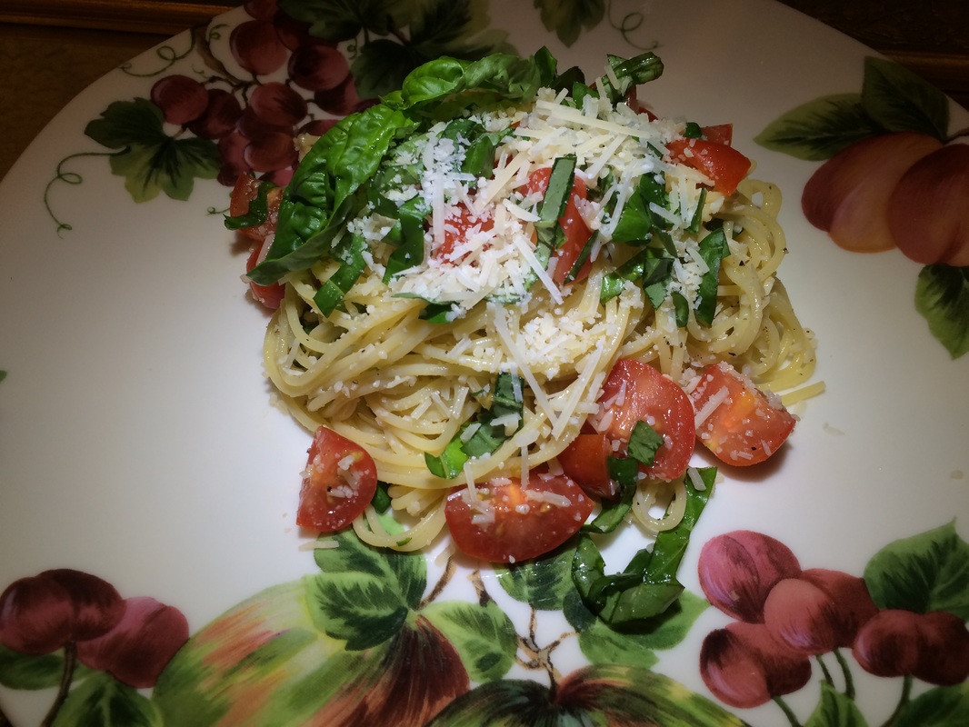
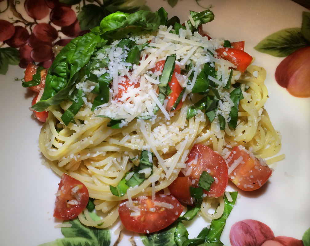
Above is a before and after comparison between my two food photos. I first cropped it, then I used the dodge and burn tool to lighten and darken the image where I saw fit. I mostly focused on brightening the tomatoes and basil. Overall, I thought that the edits resulted in a brighter and sharper image.
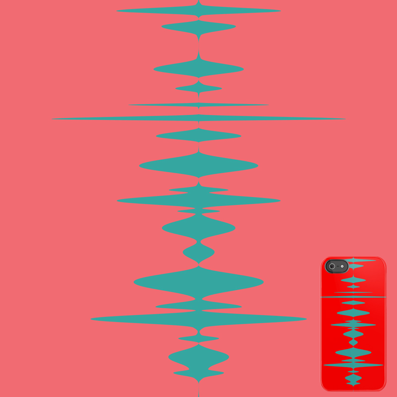
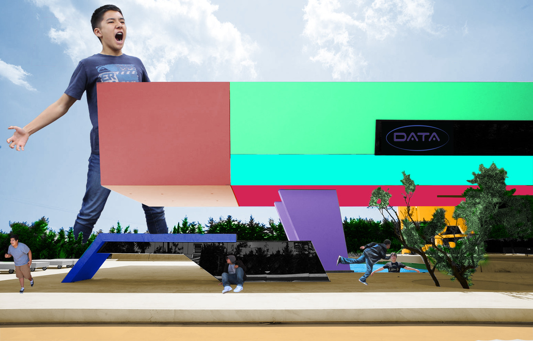
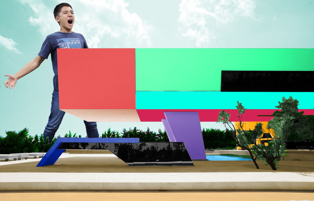
The design above is part of the DATA group project. My group individually created our own designs using various warp tools. I wanted it to look like a waveform. I mostly used the width tool while creating this design. The reason that the red is much more vivid on the phone case is because I didn't want the phone to disappear in the background.
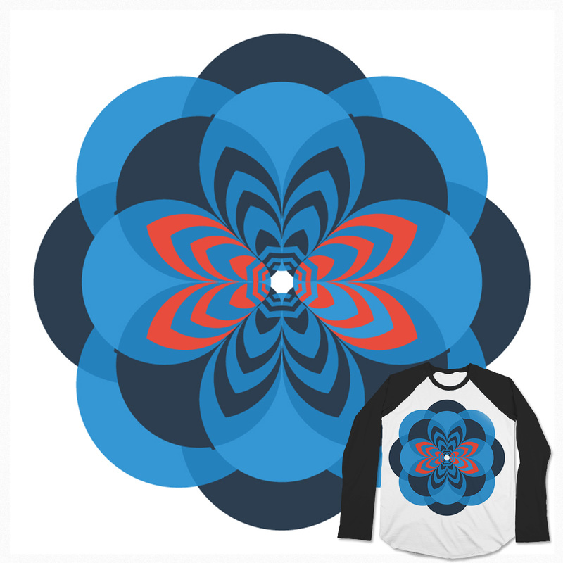
The picture above is a design that I made in Illustrator and Photoshop. It had to be a radial balance design that was copied on top of itself at least two times. I rotated circles 8 times by 45 degrees and used the shape builder tool to create the flowery shapes within the circles. Finally we had to put the design on a T-shirt using Photoshop. The color palette that I used is in the Kuler palettes and is called Flat UI.

This is a group logotype my group made. The name DATA is a combination of our first initials. We chose it because it was simple and very futuristic. The name of the font that we used is Space Age. We chose this one over the others because we thought that the color palette worked the best. I would like people to notice how the ellipse changes in width. I would also like people to notice the outline of the characters.
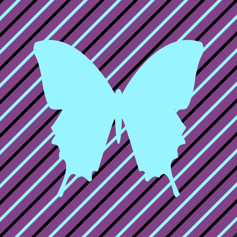
In this quick assignment I had to trace one half of a butterfly using the pen tool, reflect it, then fill the shape to create a silhouette of the butterfly. It was fun because it was the first time we really used the pen tool. I added the lines in the back for fun because I had extra time to put in the work to create them. I would like you to know that all the lines are 40 pixels apart. I chose the blue and purple because I found them in a tetrad palette together. Overall, I like how the final product looks. My favorite part is that the blue lines are the same color as the silhouette so they blend together.
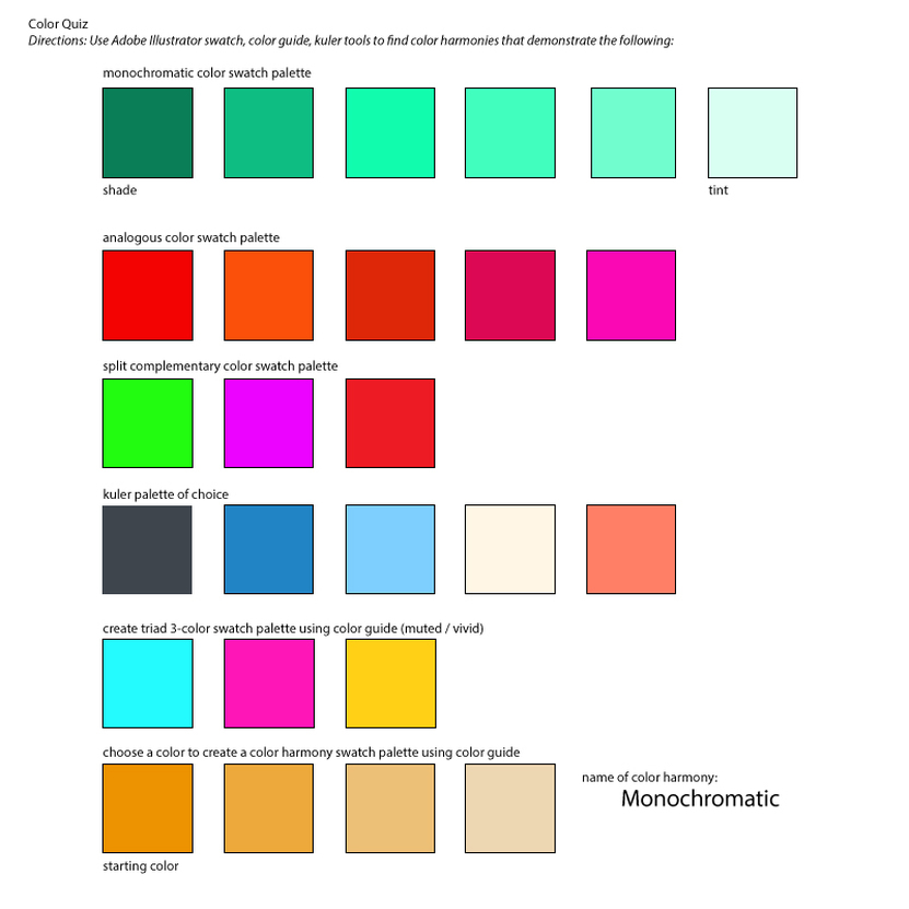
Above is a quick test that we took based on color harmonies in Adobe Illustrator. The test challenged our abilities to navigate throughout color swatches in the program. My favorite palette is the monochromatic one at the top of the quiz.
In this assignment we were instructed to take our 5 best designs and place them on either an iPhone case or a T-shirt. All of these were accomplished using a layer mask in Photoshop. Each of our images had to meet a certain requirement such as a concentric blend or symmetrically balanced.
Above is my first assignment using the shapebuilder tool. I was to create radial designs and alter them with the shapebuilder tool. I was also instructed to color them using monochromatic, analogous, and a palette of my own choice.
Above is our first assignment in Adobe Photoshop. We were instructed to take any previous design from Adobe Illustrator and paste it on our shirt. I thought that the assignment turned out well. Soon I'll learn how work in photoshop more efficiently.
Above is a slideshow showing three images that I created my own color palettes by using high quality images of nature. This was done by using the eyedropper tool in Adobe Illustrator. I haven't had much experience with color previous to starting my computer graphics class. I want to improve my skill on selecting colors in my design. I will probably use these palettes in my later designs.
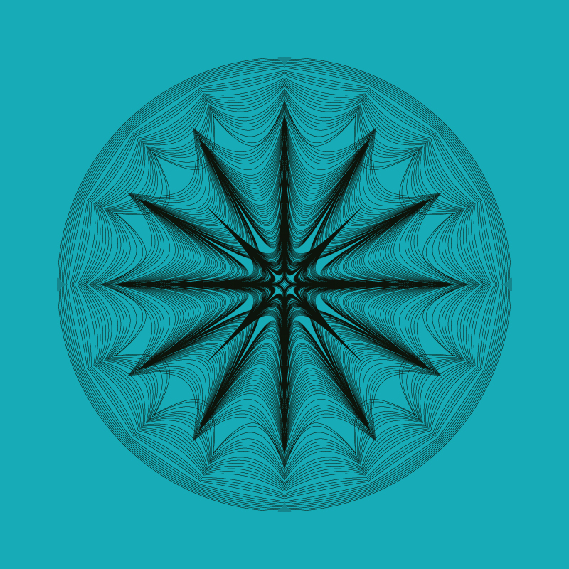
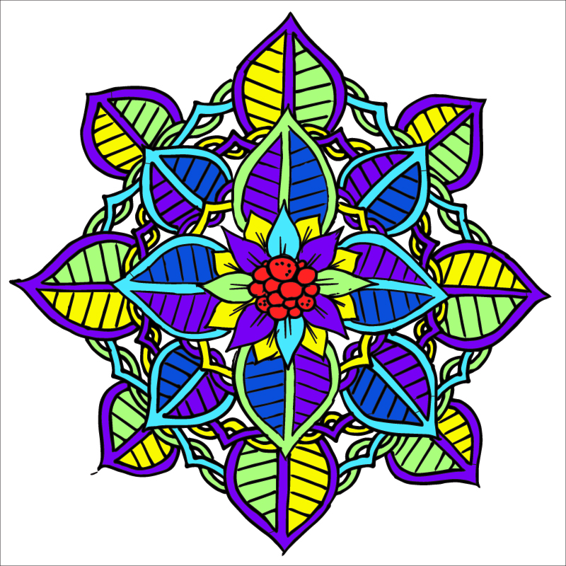
This symmetrical design was based on the pucker tool. I think it created a very dense and centered design. I liked how it gets darker as you travel closer to the center. Notice how there is a little more empty space in the center of the circle. I see this as "The Eye of the Hurricane".
There's all of this chaos surrounding one center point. And in that point, it's very simple.
There's all of this chaos surrounding one center point. And in that point, it's very simple.
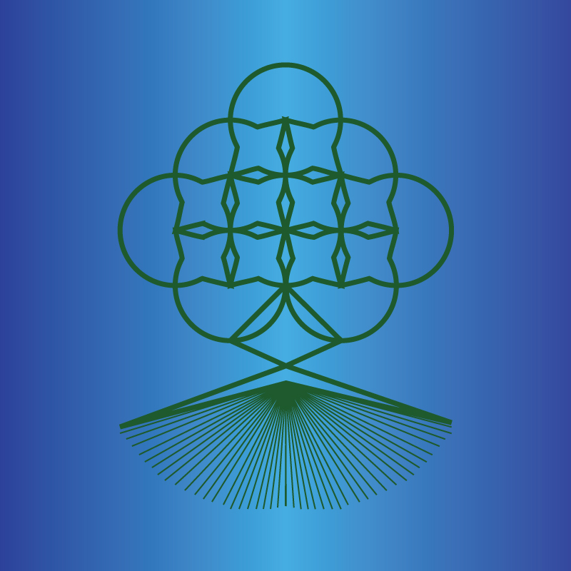
For this design that you see here, I wanted to start simple then modify later. I started with a bunch of circles and a triangle at the bottom. Using the pucker tool and the white arrow tool to create the design above. I started to make some lines to create the appearance of roots below a tree. I wanted to try to blend colors on the background. I think it created a nice effect on the image.
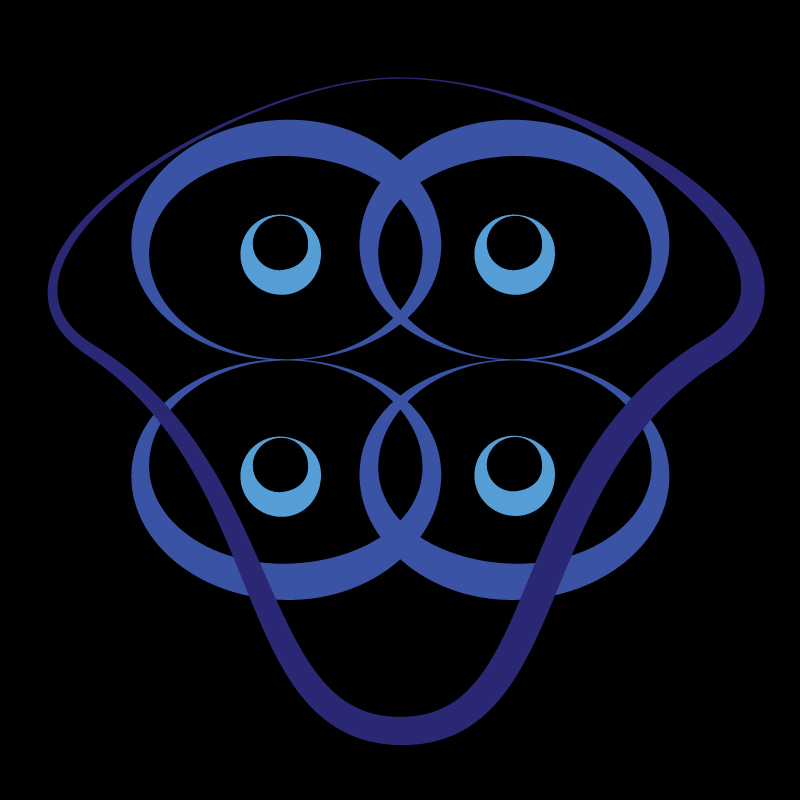
This design in particular is the first that I've incorporated the width tool. I decided to center the entirety of it around the width tool. I liked the way the width tool interacted with circles and ellipses. With this, you can achieve a really nice sense of flow. I enjoy how it has a fluid feel to it while still being symmetrical. I wanted to pay attention to the negative space as this is what our class is focusing on.
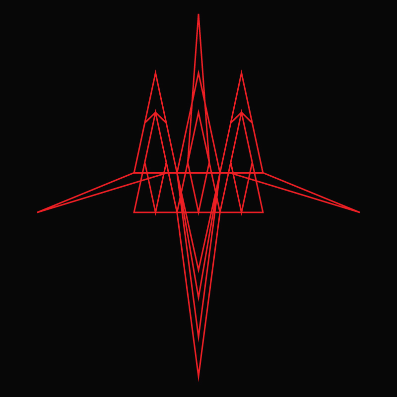
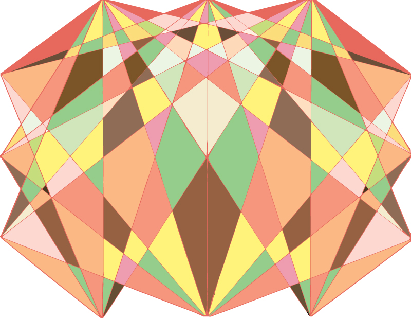
This is a symmetrical design that I made using only triangles and the white arrow tool. We're at a point in the class where we are getting more comfortable with the environment that we're in. I wanted to create a "jet" like image as you can see in the outer most triangles on the sides of the design and the sharp point at the top. To achieve a form like this, I wanted to give it an aerodynamic feel to it. I hope you enjoy it as much as I do.
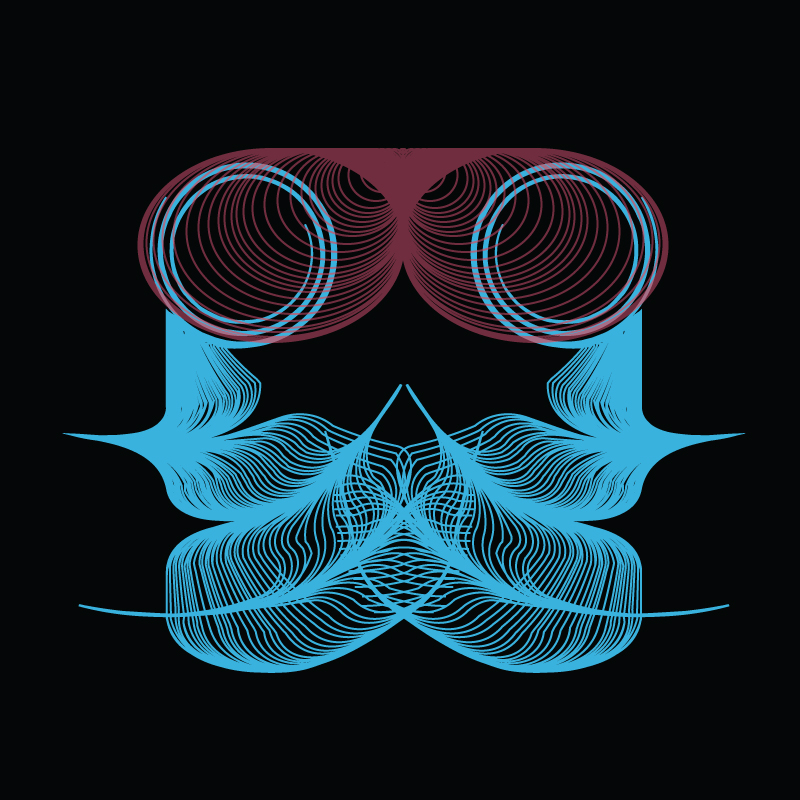
This is my first product in my computer graphics class. The assignment let us get our feet wet with the Adobe Illustrator environment. It was geared towards helping us understand symmetry as well as the impact of positive and negative space. I mostly used the arc tool and the circle tool to make the base design. To make the "cuts" across the blue section, I used the pucker tool for the first time. I also played with the spiral tool in the upper blue section of the piece. As an added touch, I messed with the opacity of the burgundy part to make the spirals more visible.
